
Without getting too into it, let's just say that Bush getting re-elected in 2004 was really tough on me and a lot of my American friends in Japan. (For more details, check out my book! On shelves sometime in early 2018.)
It was so depressing for us to see the entire midsection of the US painted in glowing, throbbing, bright, bright red. Bad enough that we already felt so far-removed from our home country just by being half-a-planet away, but now we felt like we didn't even recognize it.
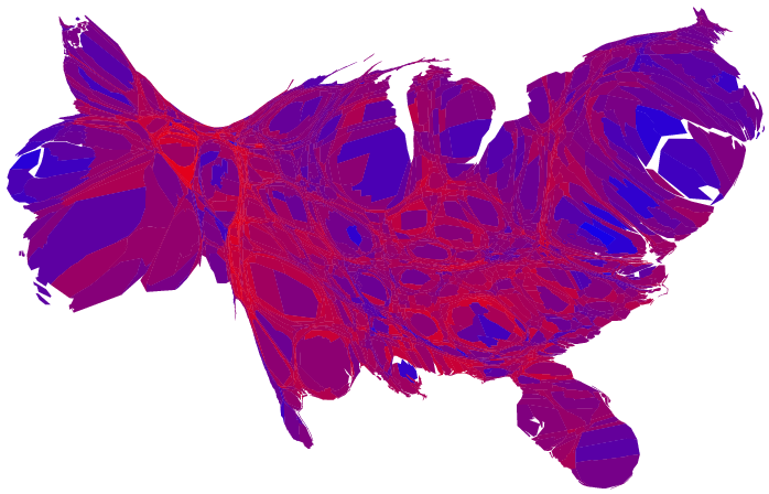
So, instead of drinking ourselves into a coma, we took solace in maps which were altered to reflect "a more realistic view" of the results.
"See, guys? If we adjust the size of each individual county by their election returns, and then use varying shades of purple instead of red and blue, and if you turn your head sideways and kinda squint, not only did Kerry do really well, but the U.S. kinda looks like a carp."
Thankfully, no such alterations have to be made this election but, I can't help but be intrigued by these 2 maps (originally from the New York Times, posted on Daily Kos).
This first map shows the counties that voted more Republican in this election than 2004.

That's amazing to me.
Why is it like that? What is it with the Appalachian region of the US? What's up with Arkansas? Was it because of Obama's race? Was it fear? Was it ignorance? Do they know something we don't know? What do you think? I'm genuinely curious.
Now, this second map is just to make "2004 Matt" feel better.

Pretty.
Best of all, these maps have helped me significantly in planning my eventual road trip from Seattle back to Florida.
Unfortunately, it's now going to take twice as long.
(Just in case you are curious, here are the 2008 electoral results adjusted to fit reality. After some deep political analysis, I'm finding that it's more phoenix-y than carp-y.)
No comments:
Post a Comment